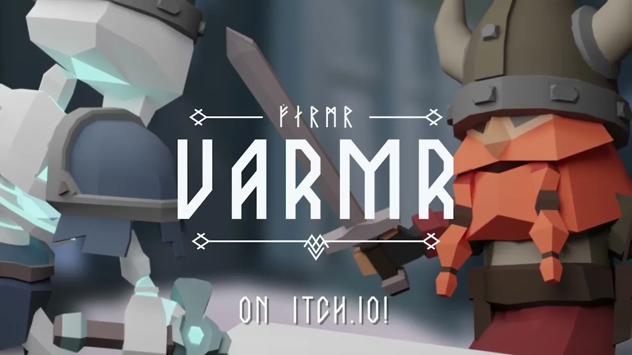
Varmr
UI/UX Leadership & UI Art Direction


Oscar Viking Jansson
Game & UX/UI Designer
2026
Game DevelopmentUI ImplementationUI DesignUX DesignUnityC#
In an isometric RPG, the UI should never compete with the battlefield. It should ground the player in the world.
For Varmr, an action-adventure game heavily inspired by Zelda, the challenge was balancing high-intensity combat readability with Norse-mythology storytelling. Serving as the Lead UX/UI Designer, I facilitated targeted ideation workshops to stress-test our HUD layouts against various gameplay constraints.
The result was a minimalist, contextual user interface that utilizes in-world element tracking and a clean typographical hierarchy to maximize immersion without sacrificing mechanical clarity.
Team Size
12
Role
Lead UX/UI Designer, Lead UI Artist & Game Designer
Timeframe
4 Weeks
Goal
Design and implement a cohesive UI/UX system for an isometric action-adventure game inspired by Tunic and The Legend of Zelda.
Responsibilities
Leading the UI/UX discipline as Lead Designer and Lead UI Artist. Facilitating workshops, directing the UI identity, and building a scalable Figma design system to deliver high fidelity UI, ready for implementation. Additionally responsible for the technical handoff, supervising responsive layout execution inside Rive and Unity.

Prioritizing Time
To optimize a tight deadline, we didn't try to reinvent established genre standards. I led a competitive analysis of similar titles to map out existing player mental models.
Prioritizing Time
To optimize a tight deadline, we didn't try to reinvent established genre standards. I led a competitive analysis of similar titles to map out existing player mental models.

Team Ideation
I structured and facilitated a collaborative workshop to test our interface layout against four distinct design philosophies.
Team Ideation
I structured and facilitated a collaborative workshop to test our interface layout against four distinct design philosophies.

Hierarchical Systems
I architected comprehensive sitemaps to secure a seamless player loop between active gameplay and settings.
Hierarchical Systems
I architected comprehensive sitemaps to secure a seamless player loop between active gameplay and settings.

Scalable UI Design
To maintain absolute visual cohesion, I established a comprehensive design system Figma, restricting production to strict layouts, spacing rules, and distinct color palettes. Components were built to perfectly mirror the requirements of our technical pipeline.
Scalable UI Design
To maintain absolute visual cohesion, I established a comprehensive design system Figma, restricting production to strict layouts, spacing rules, and distinct color palettes. Components were built to perfectly mirror the requirements of our technical pipeline.
Figma to Unity via Rive
To guarantee pixel-perfect execution, I collaborated closely with our implementation lead to build the visual assets directly within Rive, mirroring the design from Figma. This technical pipeline offloaded interface layout logic from the engineering team.
Figma to Unity via Rive
To guarantee pixel-perfect execution, I collaborated closely with our implementation lead to build the visual assets directly within Rive, mirroring the design from Figma. This technical pipeline offloaded interface layout logic from the engineering team.
Project Deep Dive
Ideation
Analyzing Genre Conventions
Instead of wasting time trying to reinvent the wheel for a 3-week sprint, we leveraged established player mental models. I led a benchmarking phase analyzing titles like Tunic and The Legend of Zelda to isolate core patterns for isometric HUD layouts, quest tracking, and navigation mechanics.
The Four Lenses Workshop
To ensure our UX strategy was intentional rather than accidental, I designed and facilitated a team-wide workshop using four distinct UI lenses to explore layout solutions.
1. The Safe Bet
Traditional placement following established genre standards for immediate familiarity.
2. The Combat Core
Maximizing player focus during intense encounters by clustering vital stats (HP, cooldowns) closer to the character to minimize eye strain.
3. The Screen Maximizer
A minimalist framework that preserves the isometric viewpoint by fading out or hiding non-essential components until contextually triggered.
4. The Wildcard
An experimental sandbox exploring non-standard, highly customized interaction paradigms.

We combined The Screen Maximizer and The Combat Core. This ensured combat felt responsive, while the overarching interface stayed out of the way of the low-poly art direction.
This was repeated for each part of the UI.
Visual Style
As both the Lead UX/UI Designer and Lead UI Artist, it was my responsibility to establish a cohesive visual identity that felt like a natural extension of the game's low-poly 3D world. To ensure team-wide alignment and ownership, I facilitated a collaborative art direction workshop.

Norse Minimalism
Clean, geometric borders inspired by traditional carvings over heavy textures, which accelerated our Figma workflow.
Subtle backdrops for visual context alongside a strict typography typescale. A clean sans-serif governs system settings, while an immersive title font handles in-world rune reading.

Architecture
I mapped out comprehensive sitemaps for the Main Menu and Pause Menu flows.
With only 3 weeks of development, the priority was eliminating navigation dead-ends and keeping the path between active gameplay and the quest logs as frictionless as possible.
The Quest Structure
Our team leaned heavily into a Norse-mythology theme, which required narrative tracking. To handle this without disrupting gameplay immersion, I architected a multi-tiered quest system.
Hierarchical Progression: Main quests (e.g., The Frozen Wellspring) are broken down into immediate sub-quests and objective trackers.
Contextual HUD Feeds: Active objectives are mapped to a clean, horizontal tracker in the corner of the screen, leaving deep lore analysis to a dedicated, off-screen Quest Journal.

Early UI Concept
To ensure cross-discipline alignment, I created a mid-fidelity HUD mockup to align the team on core interaction patterns before moving on.
The rune-based healthbars were later cut from the final game.


LoFi Wireframe
Defining the layout and overall hierarchy of the entire UI in a Low Fidelity wireframe.


MidFi Mockup
Further defining the UI and visualizing the player flow to keep the team aligned.


UI Production
Figma Design System
To achieve a fast, global production workflow, I built a rigid design system inside Figma based on strict design tokens.
Typography & Typescale
I established a strict hierarchy utilizing a geometric sans-serif font for system UI paired with a stylized, immersive fonts for in-world interactions (like reading runestones).
Color Palettes
Defined programmatic token blocks to govern visual states across the game uniformly, ensuring zero arbitrary hex codes were used during design.


Figma Components
Every component in Figma was built with Auto Layout, fixed padding rules, and absolute constraints. This wasn't just for clean files, it was to directly mirror how components behave in our chosen UI middleware, Rive, making translation to engine easier.


Figma to Rive
To ensure a pixel-perfect recreation in-engine, every Figma component was created with strict spacing, margins, and constraints to directly mirror how it would behave in our chosen UI middleware, Rive.
I collaborated closely with the UI Implementation Lead to set up layout and direct animation language within Rive, effectively shifting core layout management away from the engineering team and reducing programming overhead.
To finalize the interface's implementation, I worked with the Lead Programmer to leverage post-processing layers, utilizing depth-of-field and dynamic background darkening behind active UI elements to guarantee constant text readability during gameplay.
Reflection
Dedicating our entire first week to low-fidelity planning and workshops within Figjam proved to be a major success, aligning the team early and saving significant development time during production. However, rapid sprint cycles often cause UI implementation to bottleneck near the final deadline.
Moving forward, my primary improvement will be pushing dev-ready layout components to the programming team earlier in the cycle, ensuring a smoother implementation pipeline and keeping engineers synchronized well before production constraints mount.
Project Deep Dive
Ideation
Analyzing Genre Conventions
Instead of wasting time trying to reinvent the wheel for a 3-week sprint, we leveraged established player mental models. I led a benchmarking phase analyzing titles like Tunic and The Legend of Zelda to isolate core patterns for isometric HUD layouts, quest tracking, and navigation mechanics.
The Four Lenses Workshop
To ensure our UX strategy was intentional rather than accidental, I designed and facilitated a team-wide workshop using four distinct UI lenses to explore layout solutions.
1. The Safe Bet
Traditional placement following established genre standards for immediate familiarity.
2. The Combat Core
Maximizing player focus during intense encounters by clustering vital stats (HP, cooldowns) closer to the character to minimize eye strain.
3. The Screen Maximizer
A minimalist framework that preserves the isometric viewpoint by fading out or hiding non-essential components until contextually triggered.
4. The Wildcard
An experimental sandbox exploring non-standard, highly customized interaction paradigms.
We combined The Screen Maximizer and The Combat Core. This ensured combat felt responsive, while the overarching interface stayed out of the way of the low-poly art direction.
This was repeated for each part of the UI.
Visual Style
As both the Lead UX/UI Designer and Lead UI Artist, it was my responsibility to establish a cohesive visual identity that felt like a natural extension of the game's low-poly 3D world. To ensure team-wide alignment and ownership, I facilitated a collaborative art direction workshop.
Norse Minimalism
Clean, geometric borders inspired by traditional carvings over heavy textures, which accelerated our Figma workflow.
Subtle backdrops for visual context alongside a strict typography typescale. A clean sans-serif governs system settings, while an immersive title font handles in-world rune reading.
Architecture
I mapped out comprehensive sitemaps for the Main Menu and Pause Menu flows.
With only 3 weeks of development, the priority was eliminating navigation dead-ends and keeping the path between active gameplay and the quest logs as frictionless as possible.
The Quest Structure
Our team leaned heavily into a Norse-mythology theme, which required narrative tracking. To handle this without disrupting gameplay immersion, I architected a multi-tiered quest system.
Hierarchical Progression: Main quests (e.g., The Frozen Wellspring) are broken down into immediate sub-quests and objective trackers.
Contextual HUD Feeds: Active objectives are mapped to a clean, horizontal tracker in the corner of the screen, leaving deep lore analysis to a dedicated, off-screen Quest Journal.
Early UI Concept
To ensure cross-discipline alignment, I created a mid-fidelity HUD mockup to align the team on core interaction patterns before moving on.
The rune-based healthbars were later cut from the final game.
LoFi Wireframe
Defining the layout and overall hierarchy of the entire UI in a Low Fidelity wireframe.
MidFi Mockup
Further defining the UI and visualizing the player flow to keep the team aligned.
UI Production
Figma Design System
To achieve a fast, global production workflow, I built a rigid design system inside Figma based on strict design tokens.
Typography & Typescale
I established a strict hierarchy utilizing a geometric sans-serif font for system UI paired with a stylized, immersive fonts for in-world interactions (like reading runestones).
Color Palettes
Defined programmatic token blocks to govern visual states across the game uniformly, ensuring zero arbitrary hex codes were used during design.
Figma Components
Every component in Figma was built with Auto Layout, fixed padding rules, and absolute constraints. This wasn't just for clean files, it was to directly mirror how components behave in our chosen UI middleware, Rive, making translation to engine easier.
Figma to Rive
To ensure a pixel-perfect recreation in-engine, every Figma component was created with strict spacing, margins, and constraints to directly mirror how it would behave in our chosen UI middleware, Rive.
I collaborated closely with the UI Implementation Lead to set up layout and direct animation language within Rive, effectively shifting core layout management away from the engineering team and reducing programming overhead.
To finalize the interface's implementation, I worked with the Lead Programmer to leverage post-processing layers, utilizing depth-of-field and dynamic background darkening behind active UI elements to guarantee constant text readability during gameplay.
Reflection
Dedicating our entire first week to low-fidelity planning and workshops within Figjam proved to be a major success, aligning the team early and saving significant development time during production. However, rapid sprint cycles often cause UI implementation to bottleneck near the final deadline.
Moving forward, my primary improvement will be pushing dev-ready layout components to the programming team earlier in the cycle, ensuring a smoother implementation pipeline and keeping engineers synchronized well before production constraints mount.


Oscar Viking Jansson
Oscar Viking Jansson